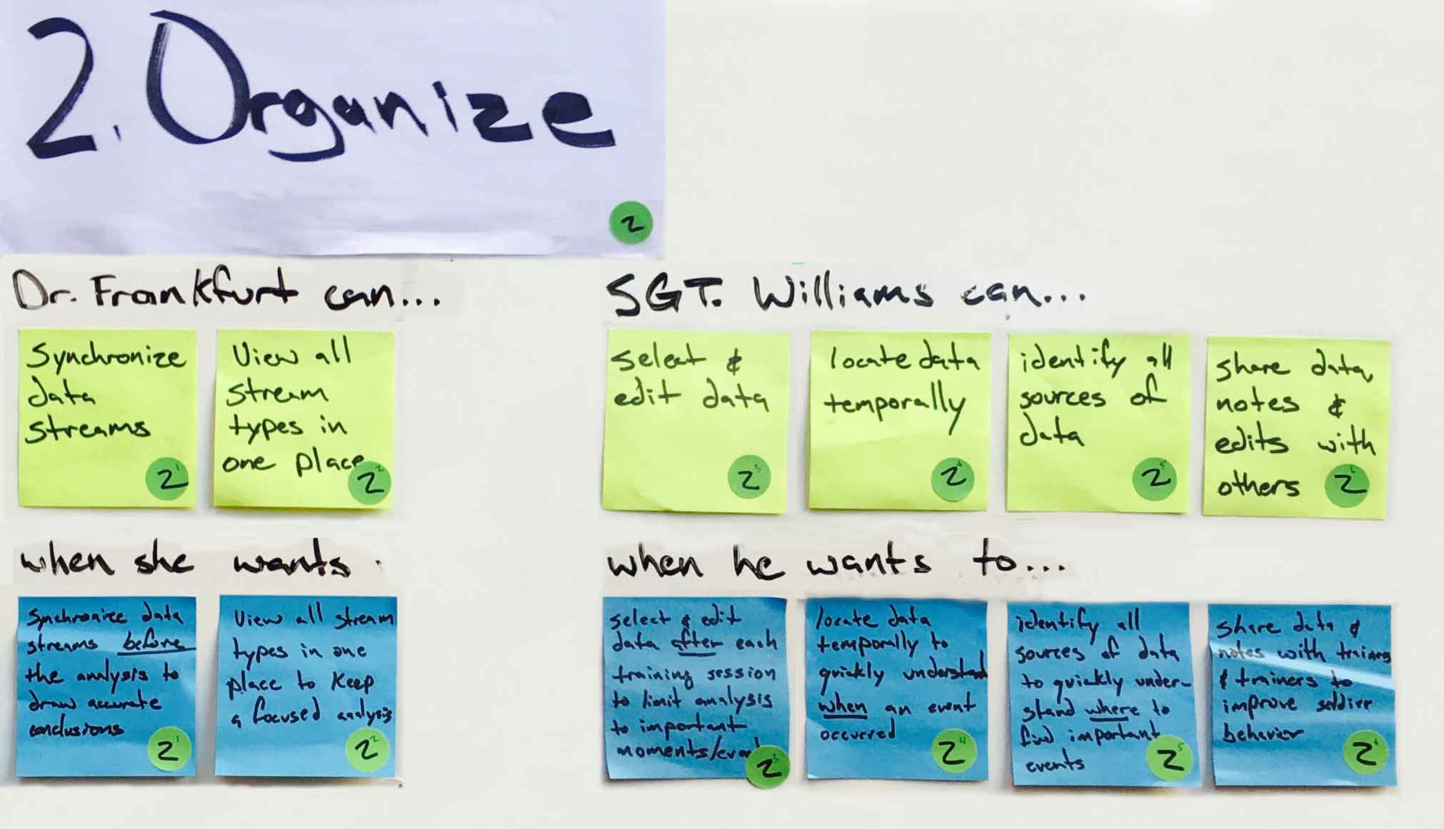
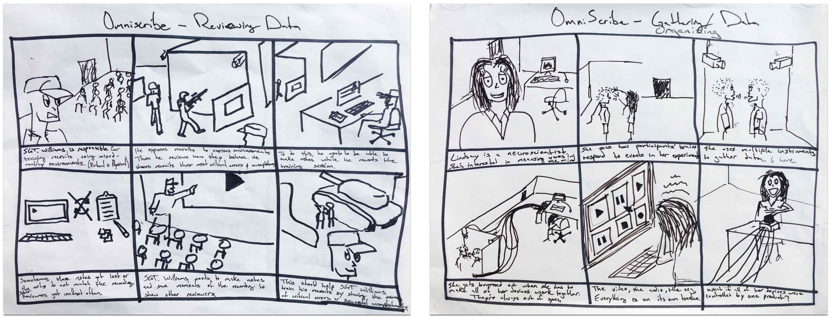
• Skip to primary navigation
  • Skip to main content
Eduardo Rubio's Portfolio

Eduardo Rubio's Portfolio

  • Home
  • About Us
  • Contact Us
  • Block Examples
  • Landing Page
  • Pricing Page
  • Show Search
Hide Search

erubio10

Vivid Reach Web Consultancy

Overview

I finished graduate school in 2014, but I didn’t get to design user experiences right away. My wife and I moved back to NM where she got a job teaching high school math. In a small town near the West Texas border, where there is zero demand for UX designers, I had to find a way to pay bills.

I started a tiny freelancing business and named it Vivid Reach Web Consultancy. My first clients came to me initially because they were interested in a website. After working with primary stakeholders and managers from different organizations, I learned how many of their goals called for more than just a website. These clients needed an online presence.


Problem Definition

My clients wanted to showcase their great work, but they weren’t sure how to use their online platform. They would have a Facebook, Twitter, or a blog, but weren’t using them effectively. Some clients didn’t have a reliable process for delivering content. Others weren’t creating enough content to update online channels on a consistent basis. Many times, their messages required more depth than 140 characters would allow. One client, Tobosa Developmental Services, came to me because they wanted a website, but my research with stakeholders revealed how they were looking for a little bit more.

Tobosa works closely with individuals who are challenged by developmental disabilities. They had done amazing work in the past and they had experienced dozens of extraordinary stories, but they never had a reliable way of sharing them with anyone online.

Tobosa's brand designed by Vivid Reach
Tobosa’s beautiful brand designed by Vivid Reach.

I formed a content strategy that focused on telling stories about their work. For years, Tobosa wanted to tell the world about how they helped individuals overcome developmental challenges. Individuals, who often came from very poor conditions and sometimes uninhabitable environments, would enter Tobosa’s programs and transform completely. To share these stories, I helped staff from within the organization write articles they could share online. Together, we created content with a clear storyline, a professional tone, and a message that inspired empathy in their readers. Their extraordinary stories became a foundation for the organization’s content strategy.

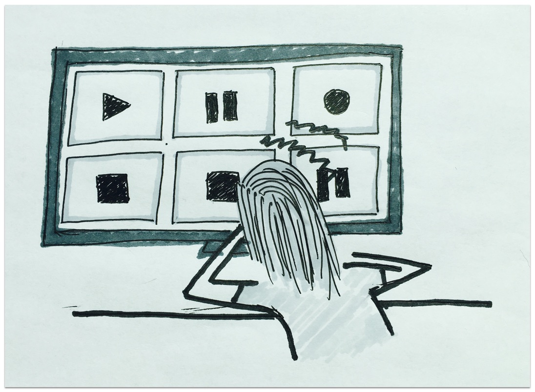
Here’s a video I prepared for one of the writers.

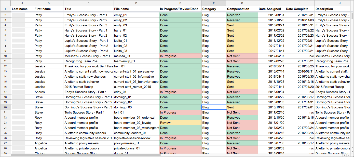
I designed an editorial process the organization could use to deliver high-quality content. I designed a living Content Matrix where we tracked authors and article progress. I revised their work and sent feedback through recorded videos of my computer screen. Once, the article was ready, we would publish it across all digital channels. As of the Spring of 2017, most articles have not been published as we wait on a budget for photography (non-profit problems).

content matrix used to track content
Content Matrix developed using Richard Sheffield’s book.


Audience

targeting audience segments with the Tobosa team
Targeting audience segments with the Tobosa team.

Tobosa is a fairly large organization with over 200 employees so they came to me with great ambitions. Their goals required a statewide audience.

“Tobosa stands for something great and that needs to be shouted from the rooftops!” – Steve Kane

Tobosa was hungry. With some discussion and prioritizing, we were able to define three primary consumers for their online content.

Personas: Current families/guardians, Donors, and Prospective staff.
Personas from left to right: Current families/guardians, Donors, and Prospective staff.

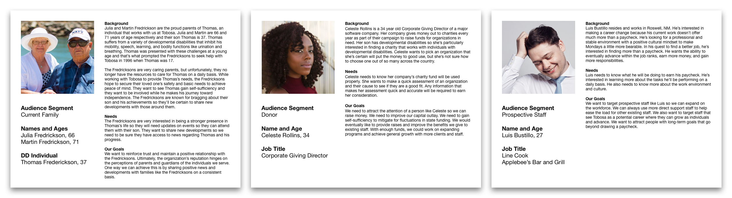
Current Families or Guardians

Business objective: update followers on current news & events.

This segment represented a large portion of Tobosa’s followers on social media. My client wanted to keep them updated on news and events in the case they wished to attend something. On a higher level, they wanted to make sure an important family member could still be a part of their special someone’s life.

Donors

Business objective: raise money and gain self-sufficiency.

Throughout its history, Tobosa has depended almost entirely on public funding provided by the State of New Mexico. Since opening their doors over 30 years ago, they’ve faced numerous fluctuations in funding, including drastic cuts leading to lost programs and opportunities. They wanted a way to reach out to private donors, share their stories, and persuade them to contribute to their cause.

Prospective Staff

Business objective: attract people with long-term career goals with Tobosa.

Unfortunately, Tobosa has faced years of high turnover rates. Tobosa employed many individuals that seemingly believed in the organization’s mission, but some only saw it as a source of income. These employees tended to not last very long. To curb their high turnover rate, stakeholders expressed interest in reaching out to community members committed to a career helping others.


Team / Role

I wore a few different hats in my work with Tobosa. At first, I was just the “website guy.” I designed and developed their website, brand, and a few print items. That role evolved into something greater once I presented opportunities to grow their online presence.

As a Content Strategist, I directed and managed eight content writers from within the organization. I set deadlines. I edited and reviewed written copy. I maintained the living Content Matrix. I organized and maintained the shared Google Drive folder with a naming scheme I designed myself. On a more strategic level, I planned and outlined articles with the writing team. I assigned topics based on their strengths, weaknesses, and interests. I gave workshops where we discussed writing, audiences, and methods for boosting Tobosa’s online presence.


Constraints

Technological experience

Most of my writing team were new to using the cloud. This created some road bumps when I tried to get everyone on Google Drive. Fortunately, I had everyone in a computer lab when we began this step so I was able to guide everyone through all the different quirks along the way.

Limited time

All of the content writers were Tobosa employees who volunteered to write for the organization on their spare time. I had to maintain a very flexible schedule for everyone. I mitigated for this constraint by allowing them to set a deadline with me according to their pace, but once we set a deadline, I would strongly encourage them to keep it. These guys were professionals. We ran into deadline problems only every so often.


Design Process

I formed the early stages of the content strategy through two workshops with all my Tobosa writers in attendance. I designed the workshops much like I design most sequential information architectures. I listed the workshop’s goals and I covered each goal through a series of note cards. The white note cards represented presentation slides or major topics that needed to be discussed. The yellow note cards were used as headlines to help me break the workshops into major sections. This method allowed me to iterate through many different sequences. Both types of cards were moved around, some were renamed, others were eliminated or replaced entirely.

The first workshop was designed to gain information on all the writers and build a profile of their strengths, weaknesses, and interests. We all gathered in a computer classroom from the local community college and that’s when I briefly introduced everyone to the main concepts we would be working with like the cloud, content strategy, writing for the web, and the Tobosa brand. I instructed everyone to answer a list of questions specially designed to gather rich information about their interests and goals. Through their writing, I was able to learn the strengths they possessed and weaknesses that needed improvement.

The second workshop was designed to help them write for the web and brainstorm personas. Largely based on the research I gathered from books on web content writing, I presented writing tips and techniques for writing for the web. To create personas, I introduced the concept of their audience and audience segments. Based on the audience segments they wanted to target, we gathered and brainstormed two major questions.

  • Why are these audience segments important to Tobosa’s online presence?
  • What are the goals of the organization pertaining to these audience segments?

I used their answers as the first round of research to get us started on some personas. We used these personas to inform their writing. Anytime a writer started a new article, I would bring up the relevant persona to remind them about their audience. Not only did this help create user-centered content, but it helped the writers overcome their own form of writer’s block. Once they had an idea about who they were writing for, they stopped writing “for the project” and started writing “toward their audience.” For some, their writing became a lot less like typing on a computer and a lot more like talking casually with the person outlined by the persona.


Retrospective

UX Principles to Create Online Presences

This project required less UX design than other projects in my past, but I still used relevant methods to perform certain tasks. For example, I used personas to form the content strategy and I used iterative design to design the workshops and the brand. While we couldn’t afford to gather real data from users to make legitimate design personas, we still adopted the user-centered mindset. For many of my clients, this was a completely new and refreshing idea.

Design vs Development Conflicts

It’s true. If you take on the dual designer/developer role, you’ll eventually short-change one. If you rush ahead, sometimes you can short-change both. Like most clients, mine deserved the elusive unicorn. They needed someone that could design a great user experience and develop it. I did my best to provide both. Their content strategy works well because it was designed well. Unfortunately, there are some aspects of my work that have fallen short of expectations.

I’m ashamed to say, but their website could use some better UX practices. Currently, their blog lists all articles in a strange way where users are having difficulty distinguishing between the blog page and the article page. Also, older articles are difficult for users to access without a search or archive function. Currently, users need to scroll all the way down the blog page to find older articles.

When I designed the website, I placed a great emphasis on web typography. As I made modifications to the WordPress theme, I believe I mistakenly made a few alterations to the layout that prevented the blog from using a side widget. This is where the search and archive function are normally placed. As a developer, I need to fix these issues without compromising the design. I recognize these problems and I’m working on a solution.

Case Study: OmniScribe

Overview

With OmniScribe, we tried to help our users capture and understand several disparate sources of data in real-time. These users needed a tool that could improve their analyses when conducting important studies or training sessions. The VRAC at ISU was granted the project from the U.S. Army.


Problem Definition

sketch depicting the problem.
Disparate data sources out of sync.

Our research found that military trainers needed to observe behavior in their training sessions and researchers needed to observe behavior in their studies. Our users were capturing a lot of data so they had to use multiple recording devices, all requiring unique configurations. A focus group session helped us confirm some of their primary needs. They wanted a central place to configure their recording devices, observe people in their studies, and understand as much as possible.


Audience

Initially, OmniScribe targeted three main groups of users: military trainers, user researchers, and academic researchers. Resource and skill constraints forced me to scope down to military trainers and academic researchers. I understood early on that this project was going to require a large quantity of time and effort so I only focused on central points delivered by the research handed to me.

Two personas used for the omniscribe case study.
Speculative* personas developed using Silvana Churruca’s DIY method.

Working with the U.S. Army, we learned of their interest in training soldiers on the field as well as the virtual lab. We also strongly considered the needs of ISU academic researchers. Both groups captured lots of time-series data and needed a tool to assist in their analysis.

The project’s initial research was based on the findings of two focus groups. I was not there for the focus groups, but I was able to conduct formative user research of my own from 2013-2014 in the form on user interviews.

*We didn’t actually gather enough data to produce the personas above. I did these for fun and demonstration.


Team / Role

OmniScribe saw multiple changes in roles throughout the course of the product’s lifecycle before I arrived. One developer was working on the project when another developer and I arrived near the later stages of the product’s development. Us three individuals, along with an advisor, who managed the project, formed a team of four. The two developers of the team were responsible for the programming and I agreed to design the UI/UX and conduct user research. A few weeks later was right about the time when I learned that I had bit off more than I could chew.


Constraints

My limited experience at the time was the number one constraint. The initial scope of the project paralyzed my decision-making so I wasn’t an effective designer in the beginning. Once I learned to use a few key design methods, I was able to put together some effective design work.

The project’s grand scope was the second constraint. Sometimes, going too big can be detrimental to a project’s ultimate success. People at the VRAC aren’t strangers to big ideas, so naturally the initial vision for OmniScribe was set high with ambition and innovation in mind. Unfortunately, developers began running into major challenges when I arrived. I sat in meetings where the developers would elaborate on the difficulty of meeting critical functional requirements. I did my best to understand their challenges and work around them. Ultimately, I focused on designing interactions that could be supported programmatically.


Design Process

Adaptive Path’s Sketchboard Technique

image labelling all the sections used in the sketchboard technique
A large 4′ by 8′ white board held all the pieces together.

Like the Q.in case study, I employed a combination of methods during the entire design process. Adaptive Path’s Sketchboarding method provided me with an invaluable macro-perspective. By helping me understand where everything fit, I could focus on designing the smaller details without losing sight of the bigger picture. For more details on Sketchboarding, please check out Adaptive Path’s article on the design method. The Sketchboarding method’s versatile nature gave me the freedom to combine design methods that made sense for different stages of the design process.

User Research

The "input" section containing all the research for quick reference.
The “input” section is used for quick reference.

The two personas, along with a list of user needs (top 16 stickies) and scenarios (bottom 16 stickies), made up the Input section, a section intended as a quick reference while sketching. I used a complete English sentence to frame how the needs and scenarios fit together.

For example…

Sgt. Williams can select and edit data (need) when he wants to limit the analysis to important moments after the training session (scenario). Mentally, I could quickly ask myself, ‘how might Sgt. Williams select and edit data when he wants to limit the analysis to important moments after the training session?’

I used the following three category labels to cover the needs and scenarios required by our personas. These broader categories helped me turn an elephant into pieces.

Users need to…

  1. Capture data (pink dots).
  2. Organize data (green dots).
  3. Understand data (yellow dots).

User Goals

Needs and scenarios belonging to the "organize data" category.
The needs and scenarios above belong to the “organize data” category.

I would like to discuss the needs and scenarios in the second category shown above in greater detail to give a concrete example of the interaction design. Here’s how our users might organize existing data.

Storyboard

Two storyboards that give the user scenarios some life.
The two storyboards that give the user scenarios life.

To begin designing interactions that helped users organize existing data, I used a storyboard to quickly demonstrate why a user may need to accomplish this goal. This served as a visual reminder to help me remember the idea behind their goal. This exercise gave the user scenarios some life.

User Flows

A task flow map of how a user review the participant's data from one place.
How might a user review the participant’s data from one place?
A task flow map of how a user might set a master timestamp using captured data.
How might a user set a master timestamp using captured data?

Once I had a strong empathetic mindset in place, I mapped out several ways the UX could support the needs and scenarios specified by the input section. Using a user flow diagram, I drew out ways the user could start and finish their task successfully. This exercise focused on how the user might accomplish a task. The map helped me understand how my users might model a specific task in their head.

Thumbnails

60 thumbnail sketches
60 thumbnail sketches to answer four design questions.

From the user flows, I began sketching UI design ideas in the form of thumbnails. The thumbnail method allowed me to develop many different ideas and cover the various ways my users might organize their data. At this stage, I spent a lot of time sketching different layouts for presenting all the information the user would need. This exercise focused on what the user might see and where the user might see it on a screen as they accomplished a task. A small description beneath each thumbnail helped me remember the main idea behind each sketch.

Wireframe

Wireframes used to map out the UI.
Classic wireframes to map out the UI.

From the large list of thumbnails, I selected the most promising ideas to support needs. In almost all cases, I’ve learned that this stage often benefits from other eyes, so I would occasionally bother friends for input. I usually selected the ideas that made the most logical sense based on my intuition and the input of others. By converging down to a few ideas, I was able to work through a logical sequence of interactions in the form of a wireframe.

Paper Prototype

Image of Paper prototype made by hand.
Paper prototype made by hand.

I used a lot of different prototyping tools, but paper prototyping took the least amount of time. It answered the questions I had, and it was the most enjoyable by far. I was able to work with my hands using all the good ol’ arts and crafts materials like construction paper, markers, rulers. I felt like I was back in the 3rd grade, except this time I could work with the big boy tools like X-acto knives!

Image of paper prototype
Paper prototype made digitally.

The prototype above was one of the latest iterations to meet user testing. The design was the most successful in helping users identify the sources of their data and organizing them.

Testing

Animated gif of interactive prototype.
Short and sweet look at my Axure prototype.

Above you will see an animated gif of an interactive prototype I made using the Axure prototyping tool. It failed miserably. Users struggled to make sense of the many free-moving panels. After selecting multiple data streams, the panels cluttered the screen and users struggled to organize or find the disparate sources of data. In one usability test, a user was able to group the data from one of the “participants in their study,” but they became frustrated when I asked them to group the data from a second participant. The results from testing the prototype above led me toward a more structured layout where users were not responsible for deciding the position of every panel.


Retrospective

Learning to Design

The biggest headaches came early in the project. As I mentioned, I had limited experience as a designer so I often found myself overwhelmed by the seemingly infinite starting points and directions. I didn’t know where to begin and I didn’t know how to let the user research guide my design process. I didn’t learn to use the most helpful design methods until much later. I spent many months trying different tools and techniques before forming the process I describe above.

Prototyping and Prototyping Tools

I used too many prototyping tools and spent too much time making digital prototypes when they weren’t necessary. I tried Photoshop, Illustrator, Justinmind, Balsamiq, Omnigraffle, Sketch, Axure. I was about to dive into Fireworks, but I wised up and went with paper prototypes before I wasted anymore time. The obvious silver lining here is that I became very familiar with these digital tools, but I’ll probably always prefer paper, pen, and markers before I launch any software tool. If I had to pick though, I would say I enjoyed Sketch for the flows and mockups, Axure for interactive prototyping, and Illustrator for high-fidelity compositions.

An Incomplete Project

We never saw the actual product come to fruition because the grant ended before we could finish. I still find this a bit sad, but that’s how some projects in graduate school turn out. Even after the project grant officially ended, my professor was nice enough to let me keep working on it since I was only a few weeks away from graduation and, well, he knew it would end up here as a case study.

Getting a Master’s Degree

In a mild sense, OmniScribe became my white whale. Of course, it didn’t cause me any major distress or harm, but the project did rob me of sleep on more than a few occasions. Once I made sense of OmniScribe’s scope, I began investigating other programs like it. In a lot of ways, OmniScribe attempted to support requirements similar to other recording programs. OmniScribe undeniably shared many properties with music recording software, movie editing software, sports analysis software, etc. I found how these programs helped users capture, organize, and understand time-series data. I found the subject so interesting that I based my Master’s thesis on how these programs compared/contrasted from one another.

Case Study: Q.in

Overview

For 2014, the Computer Human Interaction (CHI) conference student design competition required a new and innovative design for “quantifying the self.” Finding a special interest in the year’s topic, I brought together a team of five graduate students at Iowa State University to begin the project. With Q.in, we wanted to help people become aware of their posture throughout the day to make sure they did not spend too much time sitting or standing for long periods of time.


Problem Definition

Sketch depicting the case study's problem.
A prolonged period in either position is bad…very bad.

During the initial brainstorming sessions, we discovered research documenting the detrimental effects of sitting or standing for long periods of time. We found that the act of sitting or standing wasn’t the main problem. Long periods without short breaks in between were causing the most negative health effects for both sitting and standing. We found the problem serious enough to warrant a solution, so we formed our initial goal.

Goal: help users interrupt long periods of sitting or standing with a short break.


Audience

To begin user research, we constructed an online survey to quickly capture some user data. We then supplemented that research with face-to-face user interviews. Both methods targeted quantitative and qualitative data and we we targeted topics like:

  • daily activities
  • postures
  • habits
  • overall smartphone use
  • awareness of sitting and standing behavior
  • knowledge of health effects
  • willingness to modify behavior using a smartphone application
A persona used for the omniscribe case study.
We focused our persona* on one of the two user segments found.

The research pointed us toward two potential user segments worth helping, 1) people who spent too much time sitting, and 2) people who spent too much time standing. Due to a technological constraint that will be detailed in a later section, we focused on the standing segment because we knew we had the resources to help them more. These users owned smartphones and primarily carried their phone in a pant pocket. Research showed how some participants placed their phones in purses, shirt pockets, or carried them in hand, but those that stood most tended to carry their phone in a pant pocket. We used the retail salesperson archetype to personify the data we found.

*The above speculative persona was designed using Silvana Churruca’s DIY method. We didn’t actually gather enough data to produce the persona above. I made it for fun and demonstration.


Team / Role

In a team of 5, we all carried multiple responsibilities. We met numerous times throughout the week and communicated our own personal goals as well as our vision for the project. We brainstormed and listed the responsibilities the project would require. As the lead, I asked my teammates to take on two primary responsibilities they were interested in most. I chose UI/UX as my second responsibility.

Every member of our team was enrolled in the Human Computer Interaction (HCI) graduate program at ISU. This program focused on gathering HCI researchers from multiple disciplines. In a team composed of diverse minds, I understood how our team would face several communication issues. I addressed these issues by incorporating Jesse James Garrett’s Elements of User Experience into our communication. Before constructing a single wireframe, we adopted a common language to begin and end on the same page.


Constraints

A lack of technological resources played a major role in our ultimate design. We considered designs that incorporated wearables, but unfortunately none of us on the team had access to the technology yet. We decided to work with the common smartphone’s capabilities so we thought of exploiting the device’s accelerometer to determine the the user’s posture. If the smartphone was horizontal or near horizontal, the application would count the time in that position as sitting. If the the smartphone was vertical or near vertical, the application would count the time in that position as standing.

To make this design happen, we had to target users who owned smartphones and primarily carried their phones in a pant pocket, thus compelling us to select users that stood a lot. The persona above summarized the user research and constrained the project sufficiently enough for me to begin UX/UI design work.


Design Process

Adaptive Path’s Sketchboard Technique

image labelling all the sections used in the sketchboard technique
A large 4′ by 8′ white board held all the pieces together.

Like the OmniScribe case study, I employed a combination of methods during the entire design process. Adaptive Path’s Sketchboarding method provided me with an invaluable macro-perspective. By helping me understand where everything fit, I could focus on designing the smaller details without losing sight of the bigger picture. For more details on Sketchboarding, please check out Adaptive Path’s article on the design method. The Sketchboarding method’s versatile nature gave me the freedom to combine design methods that made sense for different stages of the design process.

User Research

The "input" section containing all the research for quick reference.
The “input” section is used for quick reference.

Michelle’s persona, along with a list of user needs (top 7 stickies) and scenarios (bottom 7 stickies), made up the Input section, a section intended as a quick reference while sketching. I used a complete English sentence to frame how the needs and scenarios fit together.

For example…

She can set a goal (need) when she wants to track her behavior and improve it (scenario). Mentally, I could quickly ask myself, ‘how might Michelle set a goal when she wants to track her behavior and improve it?’

I used the following three category labels to cover the needs and scenarios required by our persona. These broader categories helped me compartmentalize the problem.

Users need to…

  1. Learn about current postural habits (pink dots).
  2. Set goals for improving those habits (green dots).
  3. Interrupt long periods of standing (yellow dot).

User Goals

Needs and scenarios belonging to the "set goals" category.
The needs and scenarios above belong to the “set goals” category.

I would like to discuss the needs and scenarios in the second category shown above in greater detail to give a concrete example of the interaction design. Here’s how our user might set goals to improve postural habits.

Storyboard

A storyboard that give the user scenarios some life.
A storyboard that gives a user scenario life.

To begin designing interactions that helped Michelle set goals for improving her habits, I used a storyboard to quickly demonstrate why Michelle may need to accomplish her user goal. This served as a visual reminder to help me remember the idea behind her goal. The storyboard gave the user scenarios life.

User flows

A task flow map of how a user might set a goal to improve her postural behavior.
How might Michelle set a goal to improve her postural behavior?
A task flow map of how a user might set a goal by competing with a coworker.
How might Michelle set a goal by competing with a coworker?

Once I had a strong empathetic mindset in place, I mapped out several ways the UX could support the needs and scenarios specified by the input section. Using a user flow diagram, I drew out ways the user could begin and end their task successfully. This exercise focused on how the user might accomplish a task. The map helped me understand how my users might model a specific task in their head.

Thumbnails

60 thumbnail sketches
60 thumbnail sketches to answer four design questions.

From the user flows, I began sketching UI design ideas in the form of thumbnails. The thumbnail method allowed me to develop many different ideas and cover the various ways my users set a goal. At this stage, I spent a lot of time sketching different layouts for presenting all the information the user would need. This exercise focused on what the user might see and where the user might see it on a screen as they accomplished a task. A small description beneath each thumbnail helped me remember the main idea behind each sketch.

Wireframe

Image of wireframes
How might the user add new friends?

From the large list of thumbnails, I selected the most promising ideas to support tasks. This stage often benefits from other eyes, so I would bring in the rest of the team for input. We selected the ideas that made the most logical sense based on the research and our intuition. By converging down to a few ideas, I was able to work through a logical sequence of interactions in the form of a wireframe.

Paper Prototype

paper prototype with five pieces of the UI
How the user might add new friends.

We didn’t have a lot of time to make an interactive prototype so we made a few paper prototypes to test our ideas. The above paper prototype was the latest iteration used to test more specific questions in medium fidelity. Earlier prototypes were of a much lower fidelity.

Testing

lo-fi paper prototype with 3 screens of the user interface
How the user might compare data with other users.

The above prototype was one of the first iterations to be tested with users. The design primarily failed when users were asked to find the data belonging to other users. Many users selected the “bar graph” icon on the top-left in the first screen to accomplish this task. From the results, we decided combine the social and data aspects of the design so users could compare all data from one place.

High-Fidelity Composition

high fidelity composition of the prototype
Pretty looks don’t always do well.

I made the comp above based on an earlier prototype. The information design was a little confusing for some users when we tested it. Many were unfamiliar with the odd stacks of data because they had never seen that design before. After spending hours on the comp only to scrap most of it, I learned the importance of spending just enough time on a prototype to answer the design questions. I probably could’ve arrived at similar results with a composition containing less detail, thus saving time.


Retrospective

Design follows research

When we brainstormed initial ideas, we were armed with zero user research. We scouted for problems based on our own personal experiences. In other words, we tried to find the problems that only bothered us. By starting with zero user research, we introduced the critical mistake of projecting personal experiences onto users by assuming they experienced the same problem. A lot of great inventions can still be developed this way, but not without running the high risk of solving a problem nobody else cares about. I think the CHI Student Design Competition committee would agree because we didn’t get passed the first round of eliminations. Embarrassing, I know.

When we learned of the detrimental effects of prolonged periods in one position, we immediately began brainstorming solutions without asking anyone else how they experienced these effects. Yeah, we had traditional research like articles and study results, but the user research didn’t come until we already had a solution in mind. What’s the point of conducting formative user research if you’ve already formed the solution beforehand? In this project, we fell into a classic trap of confirmation bias. We designed a solution before we completely understood the problem and I’ll be sure not to repeat this approach in the future.

An idea means nothing without execution

VRAC Website Redesign

Overview

The VRAC (Virtual Reality Applications Center) faced a unique problem. For years, the VRAC provided researchers at Iowa State University with “world-class research infrastructure.” The technology was too good not to share. Understanding this, the VRAC created an HCI graduate program to bring students in and utilize the technology for greater research. Somewhere along the way, two websites were made; one for the VRAC and another for the HCI program. This was a problem. The two websites caused users, mostly prospective students and researchers, to understand the VRAC and the HCI graduate program as two completely different entities. Who was who?

I helped solve the problem by merging the content from the two websites into one usable website. The website currently uses the Information Architecture I designed using a content inventory, card sorting, site maps, and mockups. 

VRAC Site Map, Version Zero

Site map of VRAC website before redesign.

HCI Graduate Program Site Map, Version Zero

Site map of the HCI website before redesign.

VRAC Site Map, Final Version

VRAC website after redesign.

Hit the ground running with a minimalist look. Learn More

Eduardo Rubio's Portfolio

Copyright © 2026