Overview
I finished graduate school in 2014, but I didn’t get to design user experiences right away. My wife and I moved back to NM where she got a job teaching high school math. In a small town near the West Texas border, where there is zero demand for UX designers, I had to find a way to pay bills.
I started a tiny freelancing business and named it Vivid Reach Web Consultancy. My first clients came to me initially because they were interested in a website. After working with primary stakeholders and managers from different organizations, I learned how many of their goals called for more than just a website. These clients needed an online presence.
Problem Definition
My clients wanted to showcase their great work, but they weren’t sure how to use their online platform. They would have a Facebook, Twitter, or a blog, but weren’t using them effectively. Some clients didn’t have a reliable process for delivering content. Others weren’t creating enough content to update online channels on a consistent basis. Many times, their messages required more depth than 140 characters would allow. One client, Tobosa Developmental Services, came to me because they wanted a website, but my research with stakeholders revealed how they were looking for a little bit more.
Tobosa works closely with individuals who are challenged by developmental disabilities. They had done amazing work in the past and they had experienced dozens of extraordinary stories, but they never had a reliable way of sharing them with anyone online.

I formed a content strategy that focused on telling stories about their work. For years, Tobosa wanted to tell the world about how they helped individuals overcome developmental challenges. Individuals, who often came from very poor conditions and sometimes uninhabitable environments, would enter Tobosa’s programs and transform completely. To share these stories, I helped staff from within the organization write articles they could share online. Together, we created content with a clear storyline, a professional tone, and a message that inspired empathy in their readers. Their extraordinary stories became a foundation for the organization’s content strategy.
Here’s a video I prepared for one of the writers.
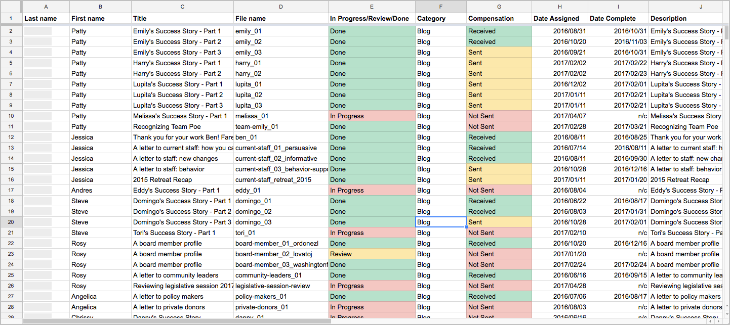
I designed an editorial process the organization could use to deliver high-quality content. I designed a living Content Matrix where we tracked authors and article progress. I revised their work and sent feedback through recorded videos of my computer screen. Once, the article was ready, we would publish it across all digital channels. As of the Spring of 2017, most articles have not been published as we wait on a budget for photography (non-profit problems).

Audience

Tobosa is a fairly large organization with over 200 employees so they came to me with great ambitions. Their goals required a statewide audience.
“Tobosa stands for something great and that needs to be shouted from the rooftops!” – Steve Kane
Tobosa was hungry. With some discussion and prioritizing, we were able to define three primary consumers for their online content.

Current Families or Guardians
Business objective: update followers on current news & events.
This segment represented a large portion of Tobosa’s followers on social media. My client wanted to keep them updated on news and events in the case they wished to attend something. On a higher level, they wanted to make sure an important family member could still be a part of their special someone’s life.
Donors
Business objective: raise money and gain self-sufficiency.
Throughout its history, Tobosa has depended almost entirely on public funding provided by the State of New Mexico. Since opening their doors over 30 years ago, they’ve faced numerous fluctuations in funding, including drastic cuts leading to lost programs and opportunities. They wanted a way to reach out to private donors, share their stories, and persuade them to contribute to their cause.
Prospective Staff
Business objective: attract people with long-term career goals with Tobosa.
Unfortunately, Tobosa has faced years of high turnover rates. Tobosa employed many individuals that seemingly believed in the organization’s mission, but some only saw it as a source of income. These employees tended to not last very long. To curb their high turnover rate, stakeholders expressed interest in reaching out to community members committed to a career helping others.
Team / Role
I wore a few different hats in my work with Tobosa. At first, I was just the “website guy.” I designed and developed their website, brand, and a few print items. That role evolved into something greater once I presented opportunities to grow their online presence.
As a Content Strategist, I directed and managed eight content writers from within the organization. I set deadlines. I edited and reviewed written copy. I maintained the living Content Matrix. I organized and maintained the shared Google Drive folder with a naming scheme I designed myself. On a more strategic level, I planned and outlined articles with the writing team. I assigned topics based on their strengths, weaknesses, and interests. I gave workshops where we discussed writing, audiences, and methods for boosting Tobosa’s online presence.
Constraints
Technological experience
Most of my writing team were new to using the cloud. This created some road bumps when I tried to get everyone on Google Drive. Fortunately, I had everyone in a computer lab when we began this step so I was able to guide everyone through all the different quirks along the way.
Limited time
All of the content writers were Tobosa employees who volunteered to write for the organization on their spare time. I had to maintain a very flexible schedule for everyone. I mitigated for this constraint by allowing them to set a deadline with me according to their pace, but once we set a deadline, I would strongly encourage them to keep it. These guys were professionals. We ran into deadline problems only every so often.
Design Process
I formed the early stages of the content strategy through two workshops with all my Tobosa writers in attendance. I designed the workshops much like I design most sequential information architectures. I listed the workshop’s goals and I covered each goal through a series of note cards. The white note cards represented presentation slides or major topics that needed to be discussed. The yellow note cards were used as headlines to help me break the workshops into major sections. This method allowed me to iterate through many different sequences. Both types of cards were moved around, some were renamed, others were eliminated or replaced entirely.
The first workshop was designed to gain information on all the writers and build a profile of their strengths, weaknesses, and interests. We all gathered in a computer classroom from the local community college and that’s when I briefly introduced everyone to the main concepts we would be working with like the cloud, content strategy, writing for the web, and the Tobosa brand. I instructed everyone to answer a list of questions specially designed to gather rich information about their interests and goals. Through their writing, I was able to learn the strengths they possessed and weaknesses that needed improvement.
The second workshop was designed to help them write for the web and brainstorm personas. Largely based on the research I gathered from books on web content writing, I presented writing tips and techniques for writing for the web. To create personas, I introduced the concept of their audience and audience segments. Based on the audience segments they wanted to target, we gathered and brainstormed two major questions.
- Why are these audience segments important to Tobosa’s online presence?
- What are the goals of the organization pertaining to these audience segments?
I used their answers as the first round of research to get us started on some personas. We used these personas to inform their writing. Anytime a writer started a new article, I would bring up the relevant persona to remind them about their audience. Not only did this help create user-centered content, but it helped the writers overcome their own form of writer’s block. Once they had an idea about who they were writing for, they stopped writing “for the project” and started writing “toward their audience.” For some, their writing became a lot less like typing on a computer and a lot more like talking casually with the person outlined by the persona.
Retrospective
UX Principles to Create Online Presences
This project required less UX design than other projects in my past, but I still used relevant methods to perform certain tasks. For example, I used personas to form the content strategy and I used iterative design to design the workshops and the brand. While we couldn’t afford to gather real data from users to make legitimate design personas, we still adopted the user-centered mindset. For many of my clients, this was a completely new and refreshing idea.
Design vs Development Conflicts
It’s true. If you take on the dual designer/developer role, you’ll eventually short-change one. If you rush ahead, sometimes you can short-change both. Like most clients, mine deserved the elusive unicorn. They needed someone that could design a great user experience and develop it. I did my best to provide both. Their content strategy works well because it was designed well. Unfortunately, there are some aspects of my work that have fallen short of expectations.
I’m ashamed to say, but their website could use some better UX practices. Currently, their blog lists all articles in a strange way where users are having difficulty distinguishing between the blog page and the article page. Also, older articles are difficult for users to access without a search or archive function. Currently, users need to scroll all the way down the blog page to find older articles.
When I designed the website, I placed a great emphasis on web typography. As I made modifications to the WordPress theme, I believe I mistakenly made a few alterations to the layout that prevented the blog from using a side widget. This is where the search and archive function are normally placed. As a developer, I need to fix these issues without compromising the design. I recognize these problems and I’m working on a solution.
