Overview
With OmniScribe, we tried to help our users capture and understand several disparate sources of data in real-time. These users needed a tool that could improve their analyses when conducting important studies or training sessions. The VRAC at ISU was granted the project from the U.S. Army.
Problem Definition
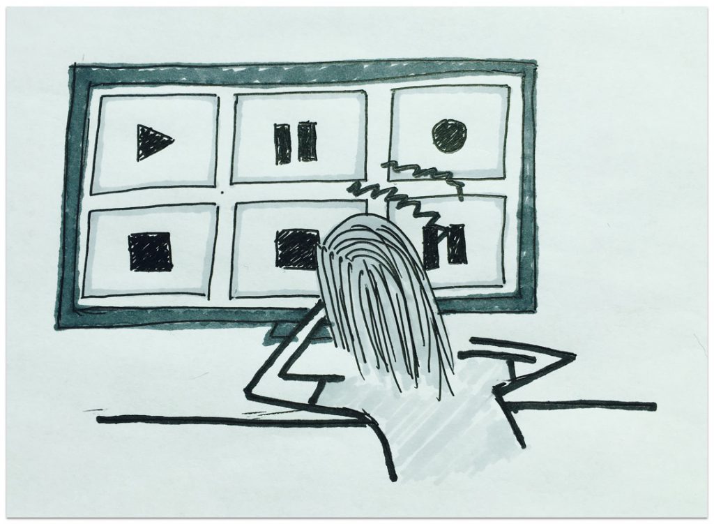
Our research found that military trainers needed to observe behavior in their training sessions and researchers needed to observe behavior in their studies. Our users were capturing a lot of data so they had to use multiple recording devices, all requiring unique configurations. A focus group session helped us confirm some of their primary needs. They wanted a central place to configure their recording devices, observe people in their studies, and understand as much as possible.
Audience
Initially, OmniScribe targeted three main groups of users: military trainers, user researchers, and academic researchers. Resource and skill constraints forced me to scope down to military trainers and academic researchers. I understood early on that this project was going to require a large quantity of time and effort so I only focused on central points delivered by the research handed to me.
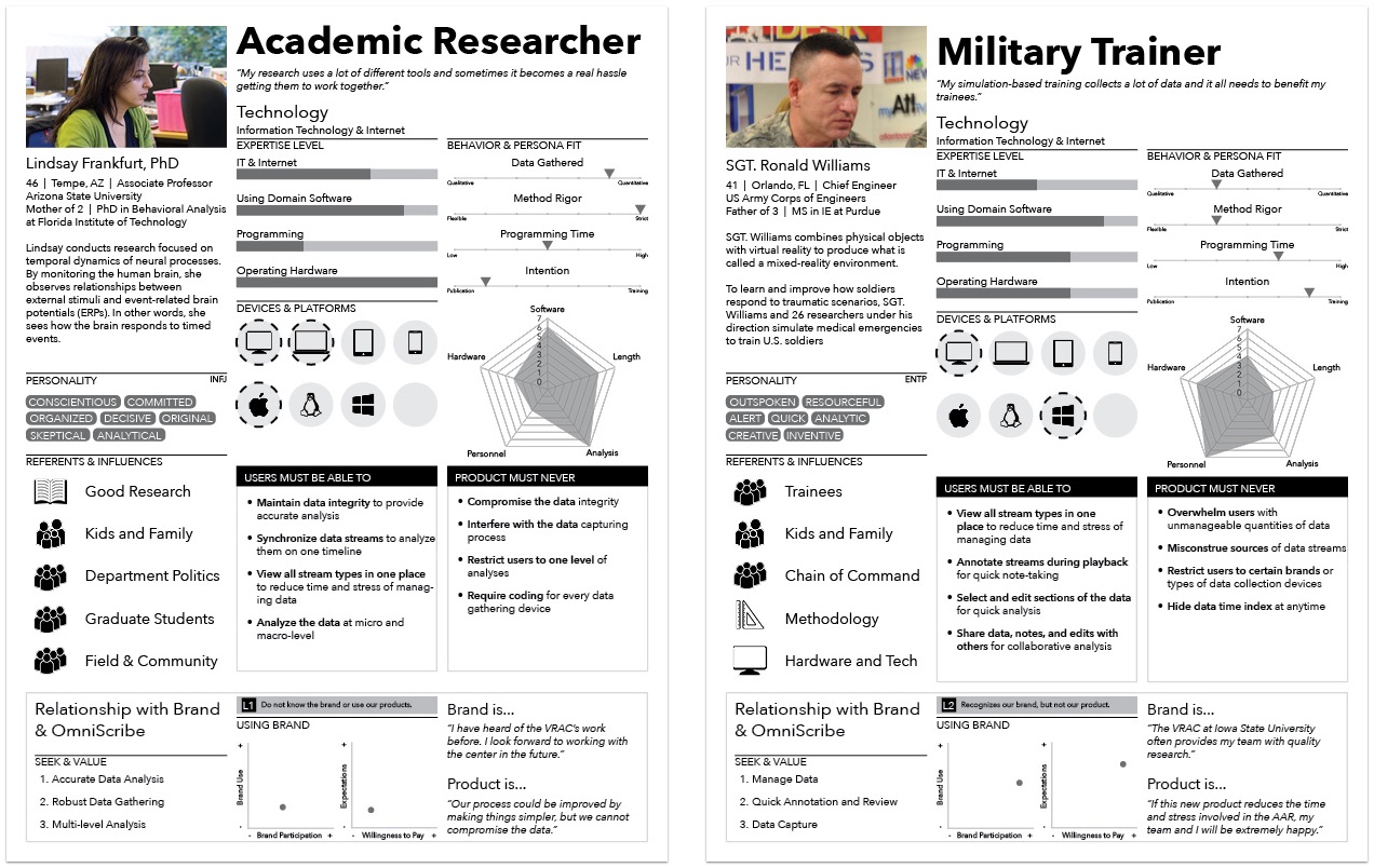
Working with the U.S. Army, we learned of their interest in training soldiers on the field as well as the virtual lab. We also strongly considered the needs of ISU academic researchers. Both groups captured lots of time-series data and needed a tool to assist in their analysis.
The project’s initial research was based on the findings of two focus groups. I was not there for the focus groups, but I was able to conduct formative user research of my own from 2013-2014 in the form on user interviews.
*We didn’t actually gather enough data to produce the personas above. I did these for fun and demonstration.
Team / Role
OmniScribe saw multiple changes in roles throughout the course of the product’s lifecycle before I arrived. One developer was working on the project when another developer and I arrived near the later stages of the product’s development. Us three individuals, along with an advisor, who managed the project, formed a team of four. The two developers of the team were responsible for the programming and I agreed to design the UI/UX and conduct user research. A few weeks later was right about the time when I learned that I had bit off more than I could chew.
Constraints
My limited experience at the time was the number one constraint. The initial scope of the project paralyzed my decision-making so I wasn’t an effective designer in the beginning. Once I learned to use a few key design methods, I was able to put together some effective design work.
The project’s grand scope was the second constraint. Sometimes, going too big can be detrimental to a project’s ultimate success. People at the VRAC aren’t strangers to big ideas, so naturally the initial vision for OmniScribe was set high with ambition and innovation in mind. Unfortunately, developers began running into major challenges when I arrived. I sat in meetings where the developers would elaborate on the difficulty of meeting critical functional requirements. I did my best to understand their challenges and work around them. Ultimately, I focused on designing interactions that could be supported programmatically.
Design Process
Adaptive Path’s Sketchboard Technique
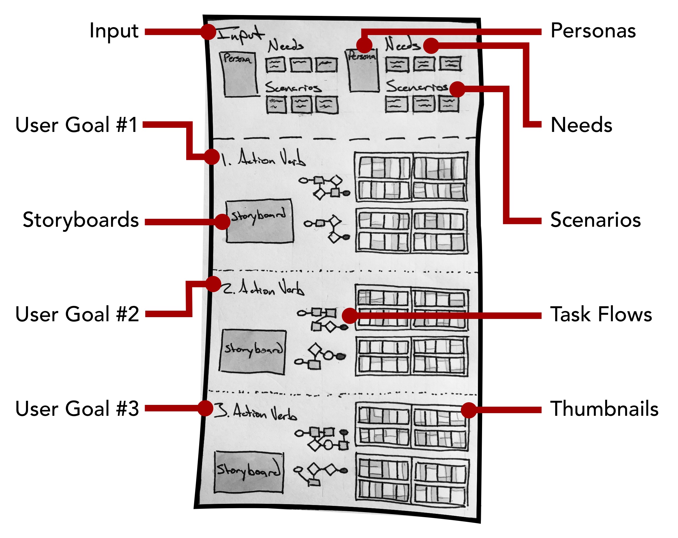
Like the Q.in case study, I employed a combination of methods during the entire design process. Adaptive Path’s Sketchboarding method provided me with an invaluable macro-perspective. By helping me understand where everything fit, I could focus on designing the smaller details without losing sight of the bigger picture. For more details on Sketchboarding, please check out Adaptive Path’s article on the design method. The Sketchboarding method’s versatile nature gave me the freedom to combine design methods that made sense for different stages of the design process.
User Research
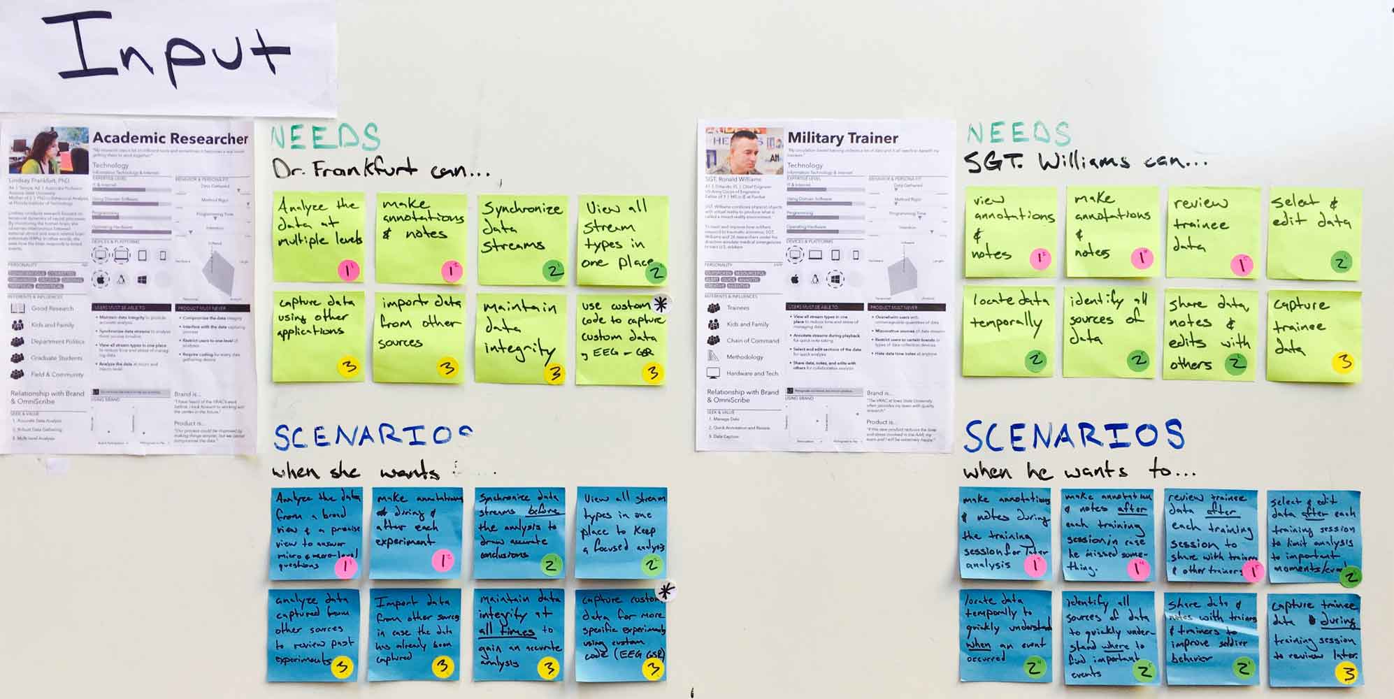
The two personas, along with a list of user needs (top 16 stickies) and scenarios (bottom 16 stickies), made up the Input section, a section intended as a quick reference while sketching. I used a complete English sentence to frame how the needs and scenarios fit together.
For example…
Sgt. Williams can select and edit data (need) when he wants to limit the analysis to important moments after the training session (scenario). Mentally, I could quickly ask myself, ‘how might Sgt. Williams select and edit data when he wants to limit the analysis to important moments after the training session?’
I used the following three category labels to cover the needs and scenarios required by our personas. These broader categories helped me turn an elephant into pieces.
Users need to…
- Capture data (pink dots).
- Organize data (green dots).
- Understand data (yellow dots).
User Goals
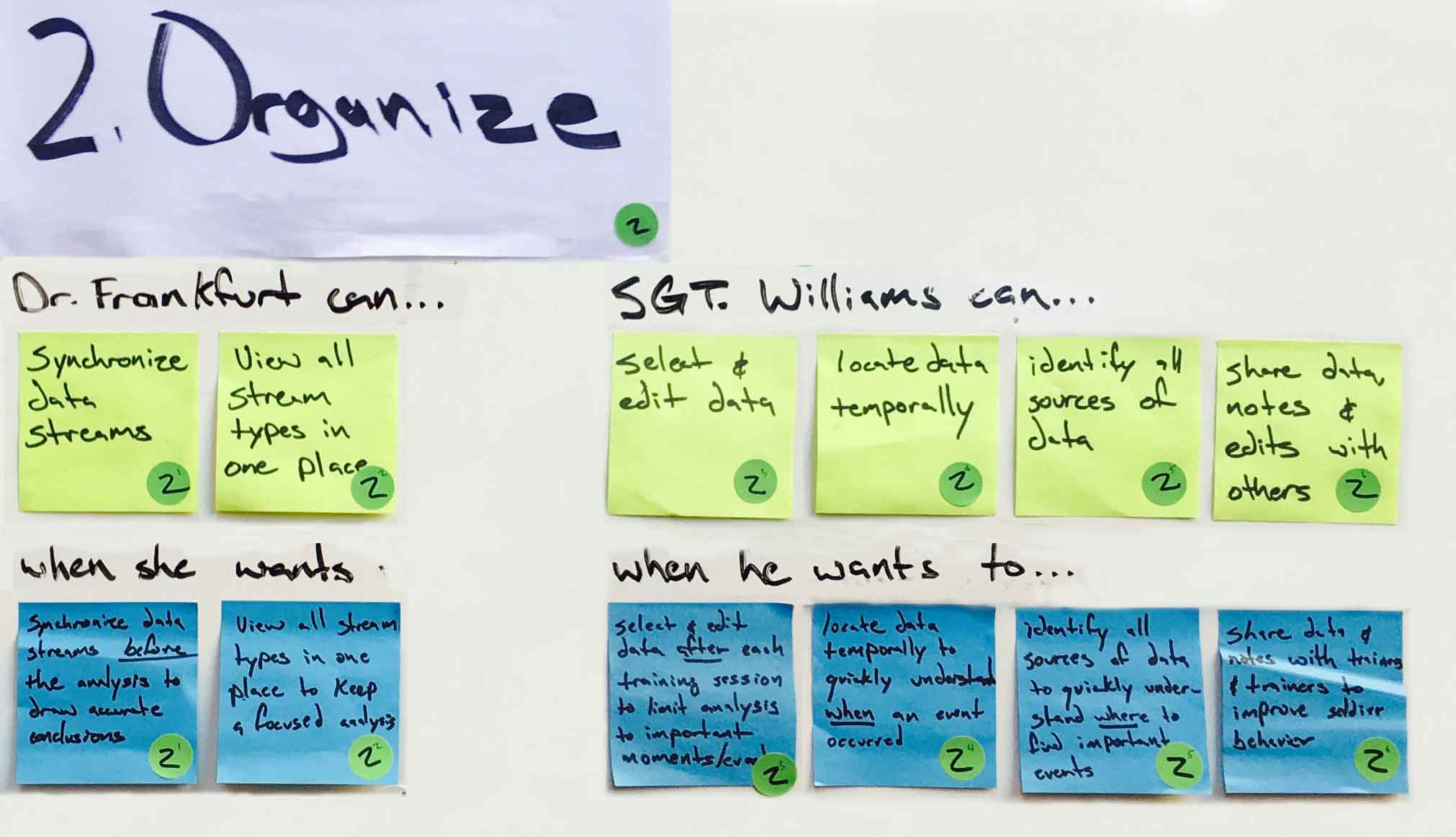
I would like to discuss the needs and scenarios in the second category shown above in greater detail to give a concrete example of the interaction design. Here’s how our users might organize existing data.
Storyboard
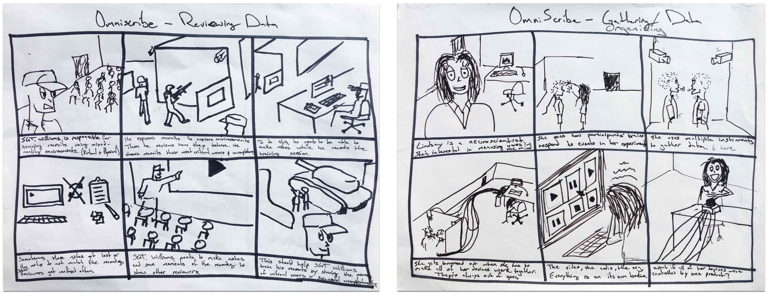
To begin designing interactions that helped users organize existing data, I used a storyboard to quickly demonstrate why a user may need to accomplish this goal. This served as a visual reminder to help me remember the idea behind their goal. This exercise gave the user scenarios some life.
User Flows
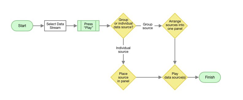
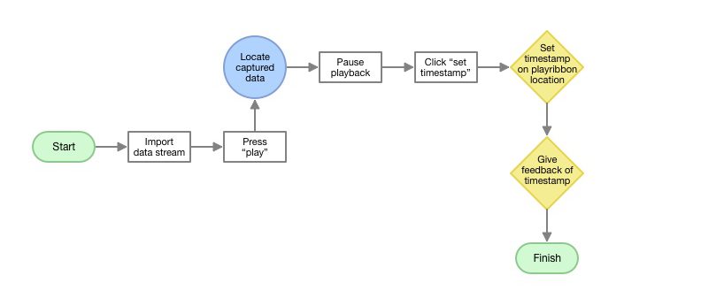
Once I had a strong empathetic mindset in place, I mapped out several ways the UX could support the needs and scenarios specified by the input section. Using a user flow diagram, I drew out ways the user could start and finish their task successfully. This exercise focused on how the user might accomplish a task. The map helped me understand how my users might model a specific task in their head.
Thumbnails
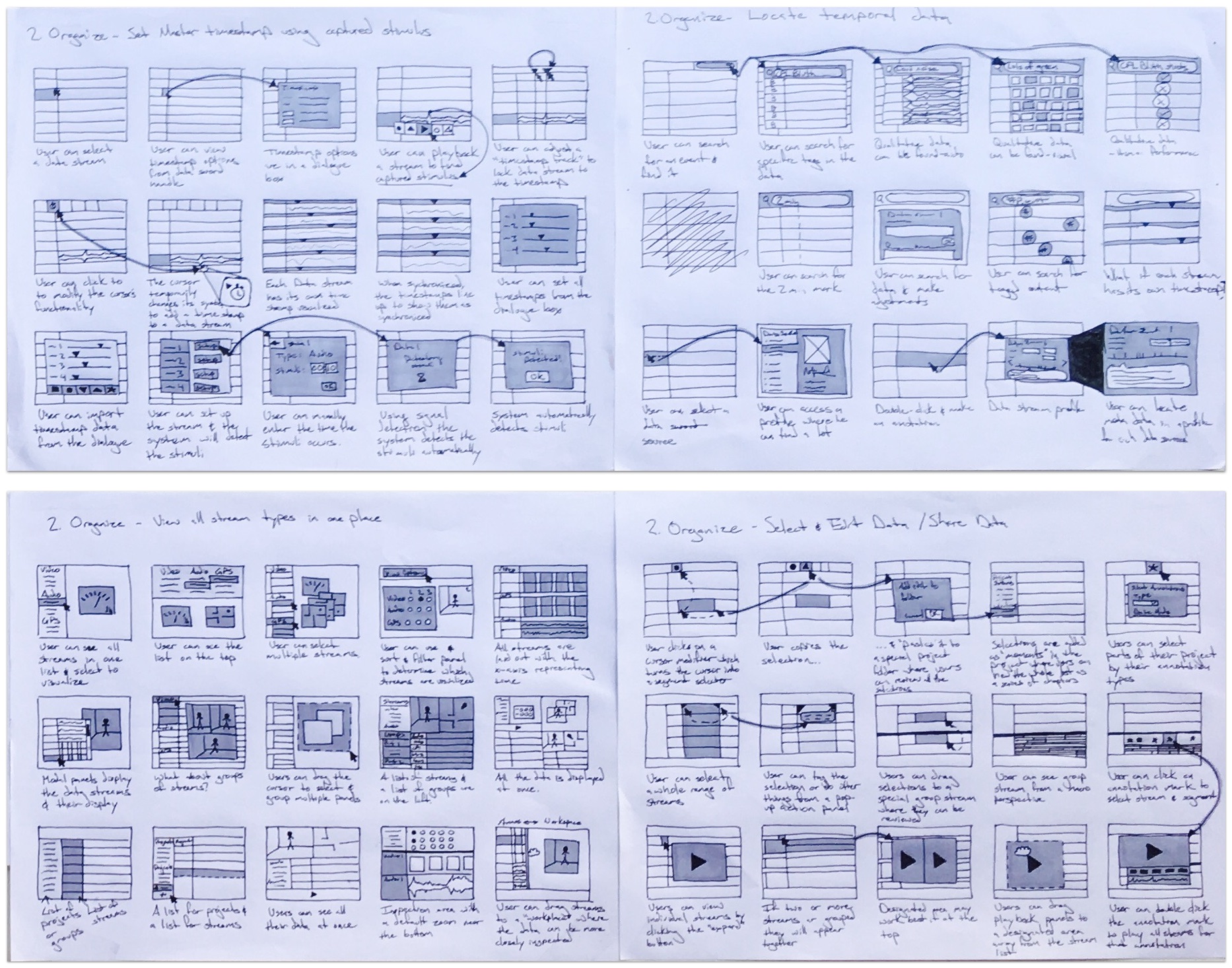
From the user flows, I began sketching UI design ideas in the form of thumbnails. The thumbnail method allowed me to develop many different ideas and cover the various ways my users might organize their data. At this stage, I spent a lot of time sketching different layouts for presenting all the information the user would need. This exercise focused on what the user might see and where the user might see it on a screen as they accomplished a task. A small description beneath each thumbnail helped me remember the main idea behind each sketch.
Wireframe
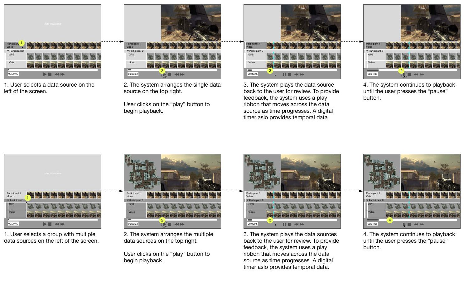
From the large list of thumbnails, I selected the most promising ideas to support needs. In almost all cases, I’ve learned that this stage often benefits from other eyes, so I would occasionally bother friends for input. I usually selected the ideas that made the most logical sense based on my intuition and the input of others. By converging down to a few ideas, I was able to work through a logical sequence of interactions in the form of a wireframe.
Paper Prototype
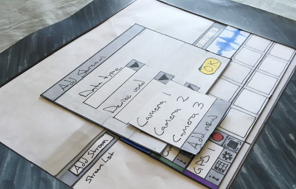
I used a lot of different prototyping tools, but paper prototyping took the least amount of time. It answered the questions I had, and it was the most enjoyable by far. I was able to work with my hands using all the good ol’ arts and crafts materials like construction paper, markers, rulers. I felt like I was back in the 3rd grade, except this time I could work with the big boy tools like X-acto knives!
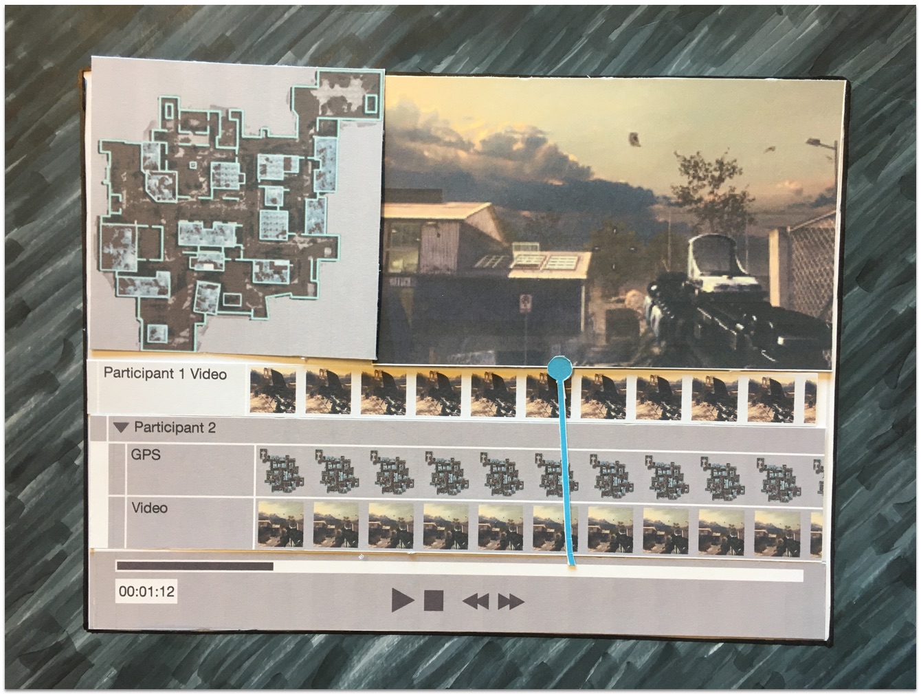
The prototype above was one of the latest iterations to meet user testing. The design was the most successful in helping users identify the sources of their data and organizing them.
Testing
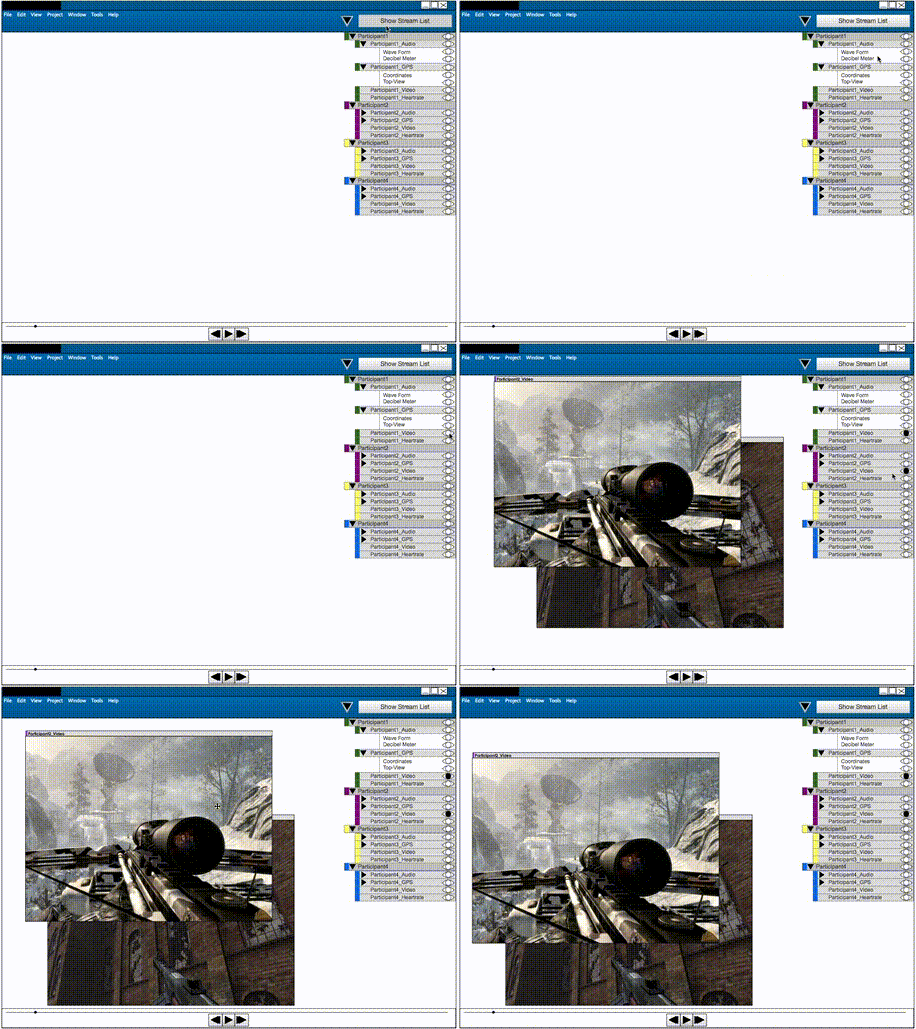
Above you will see an animated gif of an interactive prototype I made using the Axure prototyping tool. It failed miserably. Users struggled to make sense of the many free-moving panels. After selecting multiple data streams, the panels cluttered the screen and users struggled to organize or find the disparate sources of data. In one usability test, a user was able to group the data from one of the “participants in their study,” but they became frustrated when I asked them to group the data from a second participant. The results from testing the prototype above led me toward a more structured layout where users were not responsible for deciding the position of every panel.
Retrospective
Learning to Design
The biggest headaches came early in the project. As I mentioned, I had limited experience as a designer so I often found myself overwhelmed by the seemingly infinite starting points and directions. I didn’t know where to begin and I didn’t know how to let the user research guide my design process. I didn’t learn to use the most helpful design methods until much later. I spent many months trying different tools and techniques before forming the process I describe above.
Prototyping and Prototyping Tools
I used too many prototyping tools and spent too much time making digital prototypes when they weren’t necessary. I tried Photoshop, Illustrator, Justinmind, Balsamiq, Omnigraffle, Sketch, Axure. I was about to dive into Fireworks, but I wised up and went with paper prototypes before I wasted anymore time. The obvious silver lining here is that I became very familiar with these digital tools, but I’ll probably always prefer paper, pen, and markers before I launch any software tool. If I had to pick though, I would say I enjoyed Sketch for the flows and mockups, Axure for interactive prototyping, and Illustrator for high-fidelity compositions.
An Incomplete Project
We never saw the actual product come to fruition because the grant ended before we could finish. I still find this a bit sad, but that’s how some projects in graduate school turn out. Even after the project grant officially ended, my professor was nice enough to let me keep working on it since I was only a few weeks away from graduation and, well, he knew it would end up here as a case study.
Getting a Master’s Degree
In a mild sense, OmniScribe became my white whale. Of course, it didn’t cause me any major distress or harm, but the project did rob me of sleep on more than a few occasions. Once I made sense of OmniScribe’s scope, I began investigating other programs like it. In a lot of ways, OmniScribe attempted to support requirements similar to other recording programs. OmniScribe undeniably shared many properties with music recording software, movie editing software, sports analysis software, etc. I found how these programs helped users capture, organize, and understand time-series data. I found the subject so interesting that I based my Master’s thesis on how these programs compared/contrasted from one another.
